If you have followed the development of Microsoft’s upcoming operating system Windows 8 up to this point you know that the OS will ship with a store for Metro apps. That’s significant in a number of ways. A store for one means that Windows users will be able to install first and third party apps right from within the operating system without having to use a third party program to do so. While it does not cover desktop applications at all, it is a step that is both beneficial to Microsoft and the customers.
Microsoft benefits from the control that they have over the store, and the extra revenue that its generates. Customers benefit from the review process that makes sure that malicious or harmful apps are rejected right away, and ease of access.
Windows 8 Store Issues
The store as it stands now has several issues which I’d like to discuss in the following paragraphs.
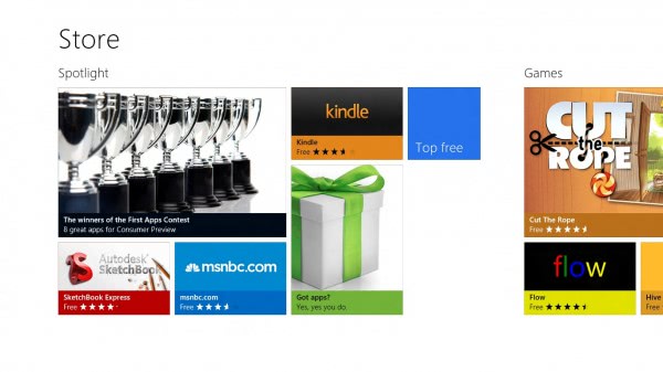
- Navigation – The only way to navigate the store is to scroll horizontally. While this may make sense on touch enabled devices, it does not offer the best user experience on desktop PCs. But even if there was an option to change the page layout and thus the scrolling direction, it would not really address the core issue: Lack of overview. How many app groups are available? You do not see that on the start page. Only after scrolling all the way to the right, and remembering the group positions. An option to jump to a specific category is missing, and Microsoft should consider adding a table of contents options to the store.
- Filters – While it is possible to display only free apps (there are no paid apps yet in the store), there is no option yet to filter by app type. If you never want to buy apps, you’d probably want an option to hide all trial and paid apps automatically from the store.
- New apps – This is one of the things that Google’s Chrome Web Store lacks of as well. There is no indication of new apps in the store. If you want to find out what’s new, you need to browse to the category that you are interested in, and click through to see if you can identify the new apps among the old. Why is there no new group or category, or a new filter available? Microsoft, look at the Mozilla Add-ons store to see how this is implemented well. The same goes for app versions and updates. Is there a way to see if an app has been updated if you have not installed it? Maybe you have installed it once, noticed that it has an error, removed it again and decided to try it later again when it has received an update?Update: Each category listing has a sort by newest option, but there is no option to sort all apps by newest.
- Language filter – The store in its current form displays apps that are written in a language that is not the system’s default language. While you see lots of English apps in the store, you will also spot French, Chinese or German apps in the store with no apparent option to filter those out.
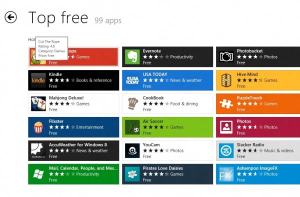
- Confusing top lists – When you open a top list of apps, you will see them all lumped together on the screen with no apparent ordering system behind it. Apps are not sorted by rating which would be an obvious choice. Maybe they are sorted by number of downloads, but it is not clear if that’s the case. It is also not clear if top apps are listed by row, or column, or another order.
- Colors – Apps are displayed in their dominating colors, which does not really make that much sense as this is not something that users consider when selecting apps. It would make more sense to give every app category its own distinct color, and use these colors instead.
- Scrolling – Hiding the scroll bar after some time may make the page look prettier, but it also remove a visual indicator on the page. The user needs to move the mouse cursor or touch the screen to display the scrollbar again. Also, why is there no automatic scrolling when you move the mouse cursor to the right end of the screen.
- Search – Why is there no search in the store? While you can search for apps using the Metro search functionality, you can’t select search in the store directly (or if you can, I have not found the switch or option to do just that). An option to just start typing like on the Metro start page would resolve the issue right away.
- Lots of whitespace – I get it. If you are working with touch, you need reasonably large icons to tap on to activate. But desktop PCs do not have those requirements. Why are there only eight and a half icons visible on a 1366×768 screen? It does not really make that much sense to me, as it means more scrolling to see all the available apps and categories.
Closing Words
The Consumer Preview is not the final version of the operating system, and as thus, the store is not final as well. It is likely that we will see changes being made to the store in the next release (release candidate or RTM). I personally would love to see a layout that is more suitable for desktop PCs. Maybe offer app listings instead of those bright colorful boxes, just like you can change the icon view mode in Explorer to list view.
Microsoft needs to work on the Windows store layout, as it simple does not work well. It is in many regards similar to Chrome’s Web Store, which for me personally, does not work at all as well. The store simply does not give me the sorting options that I want, and while that is great for the top apps and first apps listed in each category, it means that a lot of apps won’t get the visibility that they deserve.
I’d also like to see an app of the day group which highlights a great app or day prominently in the store.via[ghacks]


No comments:
Post a Comment