With temperatures rising and IPL just about to begin, we give you a few apps that could help you stay updated with the latest scores while on-the-move.
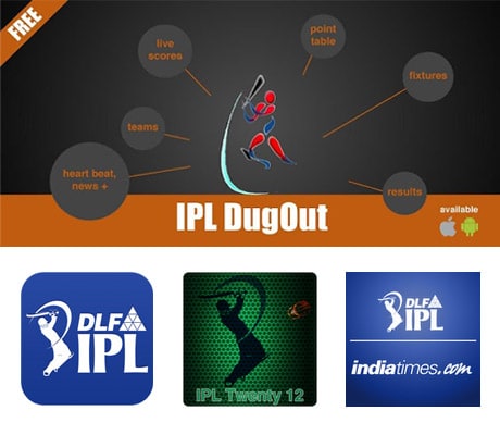
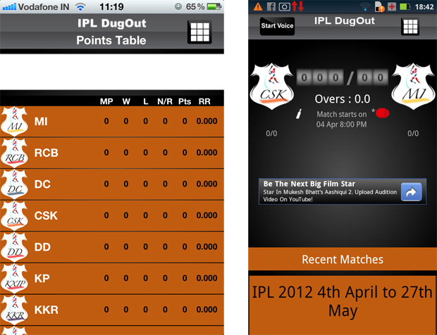
The app uses orange and white as 2 basic colour schemes. The user interface is pretty simple. The menu which gives you a range of options like Teams, Points, Fixtures, Results to name a few are laid out in two columns.
The Home screen flashes the Live score and supposedly also has an in-built ticker for scores and IPL news. The Points table is very simple. It enlists all the teams along with their wins,losses, matches played etc. The Teams option helps you see the list of teams playing this year along with the owner of each team. You can also tap on each team to get individual details of all the players.
The Results option gives you winner details of all the previous IPL matches since 2008 until last year. To go back to the main menu, just tap on the tiled icon in the top right hand corner of your screen.
You can also view the Orange cap and Puprle cap holders, maximum sixes and the longest six of a particular match under the IPL Leader category. While Fixtures give you the entire schedule for all matches, On the Map option uses Google Maps to help track all the stadiums where the matches are scheduled. It also claims to give you locations of nearby restaurants or places screening the matches.
There's also a News section that keeps you updated with the latest from the IPL. Twitter and Facebook integration is available through an option called Heartbeat.
The Android version of the app also has a voice assistant that claims to give you score updates at periodic intervals even when minimised.

IPL Dugout (Google Play, Free)
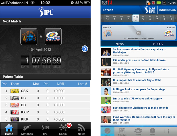
This app from TIMESMOBILE LTD, really gives you the look and feel of the IPL. Donning a dark blue colour scheme, once you open the app, you are taken to the Latest section. Right at the top you'll see a scrollable horizontal calendar bar with the dates of the matches. When you click on a particular date, it gives you the schedule just below it.
Further down you have two tabs representing News and Videos. The News section gives the latest from the world of the IPL. At the bottom of your screen, you'll find all your menu options listed.
The Schedule option clubs Results, Fixtures and By Team under 3 different tabs. Fixtures enlists the entire schedule of the IPL with the official team logos along with their venues. The By Team option is a good addition to filter out match dates according to your favourite team.
The Teams are laid out in a grid format. When you click on a particular team, the players are listed at the top in a similar horizontal scroll-like option. You can full details of each player by just tapping on them. The Stats tab gives a description of the team's best performance in the IPL yet.
The Points option neatly lays out the points table for all the teams.
What's interesting and felt a bit out of place for me is a Photo gallery that appears in the last menu option amongst News, Videos and Terms. The gallery has various photos of agencies capturing moments from last year's IPL.
The iOS version of the app, IPLt20, looked and felt really simple on the iPhone. Basic navigation felt like a breeze. A feature I thought was really cool is a countdown ticker that's displayed not just on the home screen but for every match under the Fixtures tab displaying the whole schedule.
The Stats tab under the IPL menu is divided into 4 options: Most runs, Most wickets, Most sixes and Fastest ball.
Twitter allows you to view the tweets from various players and teams while Pulse has certain questions based on the IPL and you can vote on them as the match unfolds. You can view the results debated on TV in real-time.
The only thing that was a bit disappointing is that in the Teams section, the photos of players of some teams are blank.

IPLt20 (iPhone/iPod Touch/iPad, Free)
I was instantly in awe of this IPL app al the way through. Be it the user interface or the usability factor, it is clean, slick and fast. When you first open the app, you are greeted by a beautiful sketch of a batsman at the bottom right with the app name in the centre and an animation of all the IPL teams.
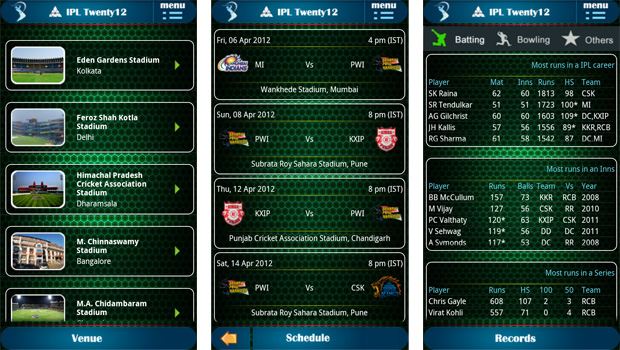
The home screen looks quite appealing with a bottle green homey-comb patterned background with the match schedule already listed. The menu button sits at the top right hand corner. When you tap it, it gives you 6 options: Schedule, Teams, Venue, Records, Sound and About.
The Teams page lists all the 9 teams for this year. To know more about each team simply tap on it. The page then gives you the team's stats with a green arrow to unveil the Team squad. You can simply keep swiping to the left to know about other teams.
The Venue option gives you a thumbnail image of each stadium along with its name. You can also know more about the stadium's history by tapping on it. This will interest a lot of cricket enthusiasts. The Records option combines player Batting, Bowling and Other records under one roof.
The IPL is incomplete without its signature tune made by the Vuvuzela. This app has a Sound option that plays it which I though was quite creative. For any suggestions or queries you can use the email id mentioned in the About section.

IPL Twenty12 (Google Play, Free)
To summarize, these are apps that will make sure that you don't miss those crucial match moments. So let the fever grip you while you take your pick!
And if you're thirsty for more information on individual teams and players, then here are a few team apps that might just satisfy you, though some of them don't seem to have been updated for this season's IPL yet.
Pune Warriors (iPhone/iPod Touch/iPad, Free)
Deccan Chargers (Google Play, Free)
Knight Watch (iPhone/iPod Touch/iPad, Free)
RCB T20 Cricket (iPhone/iPod Touch/iPad, Free)
Source from:-NDTV
No comments:
Post a Comment